There’s a New Sans-Serif in Town
Share:
![]()
![]()
![]()
The State Department names Calibri its official font
From time to time we’ll turn the last page of a book we’ve just finished reading to land on something like this:
A note on the type: This book was set in Velveeta Grande, a muscular yet sensitive font designed by the controversial Welsh typographer Scurlock Mynyddog in 1878. In its earliest applications, the typeface’s serifs had a tendency to break off and jam typesetting machines, at one point forcing a six-month shutdown of the British publishing industry and leading to the 1884 Global Punctuation Panic….
As designers and writers, marketers and storytellers, we find these back matter typographic narratives interesting, relevant and occasionally illuminating. But we’re guessing that most readers couldn’t care less. Really—isn’t a font just a font?
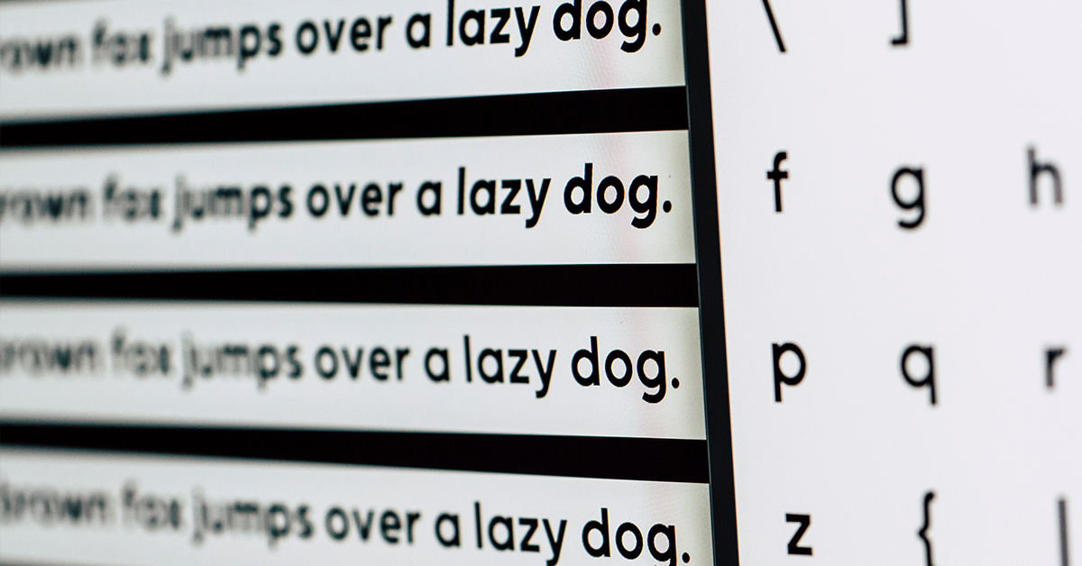
One place where fonts and typefaces definitely matter is the U.S. State Department, which recently retired serif-encrusted 12-point Times New Roman as its official font and replaced it with 14-point sans-serif Calibri. The change, recommended by the Department’s Internal Diversity and Disability Group, is aimed at making the Department more inclusive, wrote Secretary of State Antony J. Blinken in a memo headed, “The Times (New Roman) are a-changin’.” Stripped of TNR’s decorative squiggles, Calibri is said to be easier to read, especially on screen, for those with visual impairment or learning differences.
The U.S. diplomatic corps reacted well to the shift, by and large. But brickbats have been tossed. “A colleague of mine called it a sacrilege,” said one Asia-based Foreign Service Officer. Another said, “I’m anticipating an internal revolt.”
The pushback may be more than just pigheaded Luddism. Calibri is cleaner-looking and arguably user-friendlier. But like any font, it has its issues. Critics say the punctuation is too small and that there’s insufficient daylight between the dot and the lower-case i. The lower-case l, upper-case I and numeral 1 can be hard to tell apart, so that the word “Ill” could be misread as the Roman numeral III. (This brings to mind former Vice President Dan Quayle’s reference to North Korean President Kim Jong II as “Kim Jong the Second.”)
All of this is beside the point when it comes to the fonts writers favor when it’s just them and the blank screen (or legal pad). That decision is and should be totally personal. Novelist Jonathan Lethem writes only in 12-point courier because “he dislikes the temptation of making a raw draft look like it’s already typeset.” Author Caleb Crain finds Hoefler Text “polite and unobtrusive.”
We agree that whatever fires your creative synapses, go with it, whether you’re composing an email, client pitch, web content, ad copy, social media post or novel. Write in TNR, Calibri, Bon Jovi Light or Velveeta Grande. Or go old school and compose your drafts in pencil, ballpoint, Sharpie or industrial valve marker. It’s your call.
But when it comes to communicating with others on screen or paper, simple almost always beats fancy and accessibility and clarity are paramount. We’re certain Scurlock Mynyddog would have agreed.